


SnackMatch Mobile App
An end-end mobile app design project
Role
UX/UI designer; personal project
Project Timeline
12 weeks (Spring 2023)
PROJECT OVERVIEW
Project goal: Connect snack fans to share reviews and find snacks
User: Snack enthusiasts
User Problem: Discovering new snacks in a huge marketplace
Business Goal: Promote new products and excite users about new snacks
Solution: A mobile app to celebrate the discovery and social aspects of snacking
DESIGN PROCESS
Discover
Desk research
User interviews
Competitive benchmark
Define
Affinity mapping
Personas
POVs/HMWs
Develop
Brainstorming
Sitemap
Mood board, color/text styles
Wireframes, task and user flows
Deliver
Prototype and usability testing
Analyzing and prioritizing results
Iterations
DESK RESEARCH
The snack market is worth $150.6 billion. To appeal to Gen Xers and Millennials, brands are reviving old snacks and creating wild collaborations
Snack brands release new flavors and mashups of old favorites to appeal to childhood nostalgia and create viral hits. This has been especially popular with Millennials and Gen Xers.

USER INTERVIEWS
I interviewed 5 snack enthusiasts who were excited to share their favorite flavors and childhood snack memories with me
“A new flavor, you're discovering it... I would 100% try a new flavor of a brand I like, I chase new snacks. It's a dopamine rush.”

AFFINITY MAPPING / INSIGHTS
Users love snacks for discovery and nostalgia
They try new snacks for fun and enjoy familiar flavors from childhood.
Snacks have a large social component
Users like to share, rate, or talk about snacks with their friends.
Users are not very concerned about health
Users are aware that snacks may not be nutritious but eat them for fun or other reasons.
Different snacks for different needs
Snacks vary depending on the situation, such as road trips, menstruation, celebrations, and self-reward.
Common themes that emerged from user interviews included a lack of concern over health impact and a love of discovery through snacks
RESEARCH INSIGHTS: IMPORTANT FINDING
The majority of users do not research snacks ahead of time
Despite the large social aspect, users mainly consider new snacks in-store.
COMPETITIVE RESEARCH
Competitors had a tedious onboarding process and lacked features to help users discover new products
StitchFix had a very lengthy and inflexible onboarding quiz. Other apps seemed to randomly generate items of interest without allowing the fanbase to help each other explore new finds.
Other products that are geared towards enthusiasts often did not help users discover new finds
USER-CENTRIC DESIGN / ETHICAL CONCERN
Users love snacks… but don’t want to eat more than they already do
Users know snacks are unhealthy, but eat healthy overall. I won’t be designing addictive or gamifying patterns to push users to eat more. The goal is to share discoveries with friends and explore new flavors.
PERSONAS
The pull of nostalgia is a powerful emotion that draws users to their favorite snacks over and over
I started thinking about the hook that will draw in users for repeat visits to the app. Nostalgia is a powerful emotion and users enjoy connecting with each other over both new discoveries and childhood memories for retro snacks.
Snack fans who are constantly on social media and sharing new finds with friends could use consolidation
Users would benefit from a consolidation of sources for conversations or newsfeeds about snacks, whether they’re online all of the time or rarely at all (like Persona 1).
HMWs
Two user needs I decided to focus on are:
1) connecting users to help each other discover new snacks
2) curating new snack discoveries for users
DEVELOP
Ideation led to features including users sharing snack reviews and purchase locations with each other, a "surprise me" suggestion, barcode scanning, and a “I’m Craving…” quiz
I kept in mind that my users would largely be looking up items in-store or on-the-go. I also wanted to help users find new snacks and flavors, whether they knew what they wanted or were looking for something new.
Using Crazy 8 drawings to ideate some possible solutions to connecting snack fans and aiding discovery
SITEMAP
Learning from my competitive benchmark, I skipped the long onboarding to let users explore my app right away
I designed pages around users' top priorities, with some features requiring account creation. This lets users explore features first.
Bypassing an early, forced account creation allows the user the ability to explore during their initial experience
TASK/USER FLOW #1
I designed a flow for a user in a grocery store who sees an interesting new snack and wants to read reviews on it
Users told me they usually don't research snacks ahead of time and they spot new ones in the wild.
Users will be able to simulate being in a store and using their camera to scan the barcode of a snack for reviews
TASK/USER FLOW #2
My second flow is for users who know their flavor preferences and want to try a new snack
Users buy the same snacks weekly but also love finding new products or flavors.
Users will be asked to take a fun quiz to discover new snacks
MOOD BOARD
Nostalgia can trigger emotional responses that lead to purchases or engagement. Inspired by ‘90s pop culture and design, I evoked childhood nostalgia in my work- mirroring the latest trends from snack brands
I realized that snack branding and packaging would already be very bold in colors and decided to evoke that era’s colors but keep it more muted.
The 90s had very bright color palettes- as do snack product branding
COLOR STYLES
‘90s Color Palette
I decided to pick a retro color palette that hints at a throwback to the 90s but is simple and wouldn’t compete with the colors from snack packaging. I also tested for accessibility at this early phase.

LOFI WIREFRAMES
Inspiration for the home screen came from a travel app designed for exploration- not other food apps
I started with food apps since they’re adjacent to my product but they were mainly for shopping, not exploration. Airbnb redesigned their product to focus on exploration, so I looked to them for inspiration despite the different industry.
Lofi wireframes that emphasized the delight of discovering new snacks
DESIGN SYSTEM / UI KIT
Future me will thank me for using a design system
Even at this wireframe stage, I built all of my components using booleans, variants, and auto layout to insure I can quickly pivot on iterations coming out of usability tests.
A sample of incorporating atomic design into building a design system early
HIFI WIREFRAMES: FLOW #1 (SEARCH REVIEWS IN-STORE)
My first prototype let users search snack reviews by scanning a barcode or typing in the product name
Users will likely want to use the highlighted purple barcode scan to quickly find reviews while being blasted with soft rock hits in the grocery store.
The search flow allows busy shoppers to use 1-tap barcode scanning to find information and reviews for snacks
HIFI WIREFRAMES: FLOW #2 (I’M CRAVING QUIZ)
My second prototype offers users a new snack discovery through a short and whimsical quiz
The quiz will have the personality of an irreverent BuzzFeed quiz but will be shorter to minimize it feeling like work. I closely followed usability heuristics so that users always have feedback on where they are, have undo and redo (and exit) options, and recognition rather than recall of what choice they selected.
Assisting users with new snack discoveries through a fun (and short) quiz
USABILITY TESTING: MONITORED ZOOM SESSIONS
All 7 users found the two tasks very easy and intuitive
Search bar: easy to use, especially with autofill in the dropdown.
Cravings Quiz: fun, intuitive, and easy to navigate with few opportunities for erroneous entries.
Star-shape around quiz: multiple users commented it looks fun and makes them excited to take more quizzes.

FEEDBACK FROM USABILITY TESTS
Users want more curation
Users wanted more recommendations and an account, even though they knew the app would track them.
Barcode scan preferred by users- but not used (or noticed)
While users were aware of the purple barcode scan, the white magnifying glass was more noticeable.
Higher reward for Cravings quiz
Users enjoyed the quiz but wanted more recommendations and a slower reveal of results.
Carousels - some wins, some losses
Users navigated product carousels fine, but missed the Events tab, which in hindsight was also a carousel.
PRIORITIZING TEST RESULTS
Using a design system helped me quickly fix most user issues
I decided to pass on designing the onboarding/account creation flow for now.
Most usability issues could be iterated quickly due to a design system
FINAL DESIGNS
I removed the carousel page tabs and made each page distinct to help users navigate the home screens
I converted the removed “Events” tab to a carousel similar to those that my users easily navigated.
Created unique visuals for each page and moved Events to the Discovery page to help with user navigation
UI CHANGES ON HOMEPAGE
The preferred (but ignored) barcode scan button is now more visible with higher contrast
Users liked the decorative quiz star, so I made it a button to a new page with more quizzes as they had requested.
Users did not notice the highlighted purple button in tests so it was redesigned as a white button for higher contrast
PRECISION WITH COPY
Users exhibited hesitancy or confusion if any of the copy wasn’t very explicit
I improved the copy throughout the product so users did not have to infer the meaning in links, descriptions, or captions.
Rewriting copy so that users can connect how writing a review helps other users locate snacks
I’M CRAVING… MORE QUIZZES
Users want more quizzes because they’re using this product for fun
I have to think about how my users would use this product- it’s for entertainment, used during free time. I thought that they would find quizzes tedious but they actually wanted a lot more.
Users wanted more quizzes for the entertainment value beyond simply finding new snacks
I’M CRAVING… QUIZ
Converting text to visuals
I preserved the heuristic of allowing users to know what their status is while improving on minimal design.
Creating a more minimalist design for the quiz interface
I’M CRAVING… QUIZ
Users want to feel rewarded and that the product is working for them
Users loved the “I’m Craving” quiz and wanted more recommendations. I also included a load screen to make it seem like the quiz results took effort to produce.
Users felt the original transition to the quiz results was too abrupt and wanted to see more recommendations for their efforts
FINAL PROTOTYPE
I updated my designs to increase usability and delight for my snackers
The final prototype for my SnackMatch mobile app can be previewed here or in the live preview below.
REFLECTIONS / WHAT I WOULD DO DIFFERENTLY
It’s a snack app, not doing taxes
I need to think about how, when, and why users would use my app. Because it’s for fun, they enjoy features like quizzes and want to take more.
Users have a social relationship with tech
Users expect technology to think or work for them and trying to save them time by immediately revealing quiz results felt unearned.
Users expect curated experiences
Allowing users to have immediate account creation so they may have more specific recommendations that aligns with their needs and expectations.
Copy is crucial
Users are confused when the copy implies a connection vs labeling it plainly and clearly for them.
NEXT STEPS
Pairing user and business needs 🤝
USER NEEDS
Users want international foods added
Curated snack boxes delivered to their homes
More connection between SnackMatch and other apps users regularly utilize for shopping lists/trips (e.g., Walmart, Target, etc.)
BUSINESS NEEDS
Expand to include more products in different markets to promote more brands
Potential partnerships with Amazon, Instacart, etc.
Potential partnerships with Walmart, Target, etc.
More fun features in the future to continue to hook users to return
More Case Studies
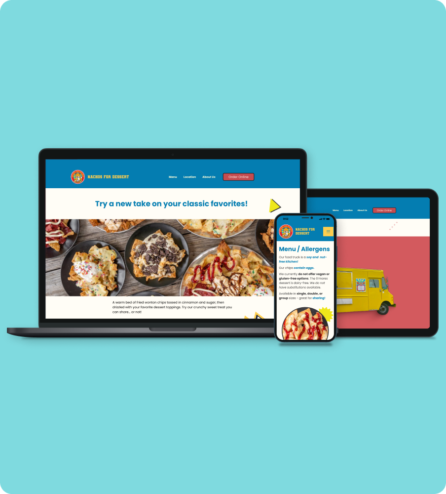
A responsive website redesign for a local Portland food truck.

An add-a-feature (and redesign) of the Nintendo Switch Online mobile app.