


Nintendo Switch Online App
An add-a-feature (and redesign) project
Role
UX/UI Designer; personal project
Project Timeline
12 weeks (Summer 2023)
PROJECT OVERVIEW
Project goal: Connect Nintendo gamers around new game releases on Nintendo’s mobile app
User: Nintendo Switch gamers
User Problem: Few engaging features on the mobile app
Business Goal: Increase Nintendo Switch app download and usage rates
Solution: Creating experiences to allow gamers to connect with each other in an asynchronous way
DESIGN PROCESS
Discover
Desk research
User interviews
Competitive benchmark
Define
Affinity mapping
Personas
POVs/HMWs
Develop
Brainstorming
Sitemap
Mood board, color/text styles
Wireframes, task and user flows
Deliver
Prototype and usability testing
Analyzing and prioritizing results
Iterations
BACKGROUND
The Switch console has an accompanying, barebones mobile app for accessing bonus game features
The Nintendo Switch Online App offers additional features for some Switch games with a paid membership to Nintendo Switch Online. The app has some very basic online gaming features but lacks offline messaging and eShop access.
DESK RESEARCH
Nintendo's business model focuses on a broader range of customers rather than serious gamers
Nintendo targets a more inclusive and casual audience with their games. They focus on delightful gaming experiences instead of chasing top hardware specs.
In 2022, Nintendo had 28% of the console market, behind Sony's 45%.

Microsoft’s Xbox (left) and Sony’s PS5 (right) appeal to serious gamers, while the Nintendo Switch (center) is regarded as more casual.
USER SURVEY / APP STORE REVIEWS
I combined feedback from hundreds of Nintendo Switch Online App reviews and my user survey
The app has a 2.9 star rating (10.2k ratings) in the Apple App Store and comments from users questioning why such a feature-less app even exists
Of my 79 Switch gamer respondents, only 29% have it on their phones; 65% have never downloaded or used it
AFFINITY MAPPING / SURVEY INSIGHTS
Most Switch gamers are casual players
60% of gamers only play for 1-4 hours a week.
Users already find it very easy to buy digital games from Nintendo
Users do not seem to miss or need mobile access to the eShop.
Switch gamers do not purchase new games frequently
The majority of Switch gamers (67%) buy only one game every 3-6 months, and 20% buy only one game per year.
Bonus game features are the most common reason to use the app
50% of gamers use the app for game-specific bonus features, and 25% use it for My Nintendo account management.
Switch players mainly use the app for bonus game features. Despite all of the complaints, they did not have suggestions for new features they need.
EMPATHY MAP
Users are frustrated with the app but often cannot easily verbalize what it is that they need
Combining survey results and comments with App Store reviews reveal users’ disconnect with the app and its barebones features - but, they aren’t necessarily needing access to chat, an eShop, or other standard features.

USER RESEARCH INSIGHTS
A clear message from survey respondents and App Store reviews emerge: even if they can’t verbalize what they want, players expect something different from Nintendo
Despite complaining about a lack of basic features like in-app Chat or an eShop, users also indicate they don’t need those features (as reflected in my survey results). Instead, they seem dissatisfied that there’s not more engaging content on the app.
RESEARCH INSIGHTS: IMPORTANT FINDING
Even casual Nintendo gamers have a huge surge of excitement for new title releases in their favorite franchises
A survey respondent commented they would play more hours after the new Zelda game comes out that week. I closed the survey a day early to avoid skewed data.
The aging Switch console- now over 6 years old- saw sales increase by 39% across Europe in May when the new Zelda game was released. This showed that even casual gamers have heightened engagement when a new title in a legacy franchise is coming out.
COMPETITIVE RESEARCH
Nintendo targets a wider audience than other gaming or entertainment apps, which often target teens and young men with their visual design
The visual design and tone of the 2 game console apps (PlayStation and Xbox) felt more serious and masculine than Nintendo’s. They also both offer standard features like integration between a player’s Wishlist and the eShops.
I looked at Netflix’s entry into mobile gaming apps and a humor/entertainment app, iFunny. Netflix's gaming section is currently sparse and iFunny also feels very targeted towards younger men.

The PlayStation and Xbox apps seem geared towards serious gamers; Netflix is just starting their entry into gaming and iFunny’s visual design and content is primarily targeting young men.
HMWs: A TRIFORCE OF INSIGHTS
How might we… help excite and re-engage the Nintendo gamer community with more useful game features via the mobile app?
I thought of 3 insights I gained from the survey and app reviews and combined their HMWs to help lead my ideation.
DEVELOP
I felt constrained by Nintendo’s infamous gatekeeping of their IP, but worked with it to consolidate fan offerings. I also used wording from their website, including the phrase “player’s poll”
I researched official Nintendo marketing campaigns and freebies to promote new game releases. I redesigned the most utilized app feature, game-specific features, to allow users to preview the service and sign up for a membership.

Nintendo gave players a Zelda Explorer’s Guide for the franchise’s last title release and free player polls to engage fans in the community
USER-CENTRIC DESIGN / ETHICAL CONCERN
After studying a very successful game, I took the opposite approach for a new in-app feature
I researched Farmville's addictive game mechanics which trap users in a never-ending loop of gift-giving. Even when it's no longer fun, users feel obligated to keep playing.
I designed a new feature to allow players to share in-game Zelda recipe cards without the need for an actual gift exchange. This allows asynchronous connection between busy Zelda enthusiasts while removing the feeling of social obligation.

Farmville (top) traps players in a gift-giving loop. My new feature lets users share in-game Zelda recipes (bottom) without exchanging goods.
TASK FLOW: PLAYER POLL FOR NEW ZELDA GAME
I redesigned the currently locked in-game features on the app to allow users to connect with each other on player polls
I streamlined the login process and added polls for players to connect with their community about new releases. This allowed busy players to engage with other fans on their own time.
As a quick secondary task, I will ask users if they can find the "log out" link on the redesigned profile/settings page.

The game features have been redesigned so users can preview what is behind the membership paywall
COLOR STYLES
I replaced Nintendo's overuse of red with a new color that is still on-brand
To improve visual design and heuristics, I used a pre-approved Nintendo CTA color on a more modern white background. I exchanged red (often associated with errors) for a “Mario suspenders” blue from Nintendo's website. I tested for accessibility with text/colors early on.
LOFI WIREFRAMES
My lofi wireframes simplified the homepage, clarified the profile/settings page, and added a new section for their game features page
My survey showed app users primarily used game-specific features. I rewrote the copy and redesigned the game features to offer free content and a paid membership preview.
Lofi wireframes simplified a homepage with few features and added/ redesigned a new Zelda game features page
DESIGN SYSTEM / UI KIT
My design system improves heuristics in the login screens and facilitates adding new player polls in the future
I used variants and components built with auto layout to speed up iterations after usability tests.
Making even a small design system allows for early experimentations with color styles and text, as well as more proficient iterations later on.
NINTENDO’S CURRENT LOGIN SCREENS
I simplified Nintendo’s current 8(!!!) login screens
I broke down the different content Nintendo wanted to cover and collapsed it into 2 screens.
Nintendo’s current login flow. One user reported “I’ve tried to log in a few times but I always give up around the 3rd screen”
HIFI WIREFRAMES: HOMEPAGE
I redesigned the login flow, homepage and profile pages to increase usability for gamers
I condensed the 8-screen login process into one, combined voice chat and online friends, removed the carousel, and separated profile and app settings.
Preventing erroneous entries during login and removing the carousel helps increase usability for players
HIFI WIREFRAMES
Users currently cannot preview the exclusive game features that are only available to Nintendo Switch Online members. I redesigned this flow and divided it into freebies and paywalled content
I used a different color palette to guide gamers to a Zelda-themed experience, consistent with the current app’s other game pages.
Adding Nintendo-approved freebies to engage fans who are excited about a new release in a legacy franchise
USABILITY TESTING: MONITORED ZOOM SESSIONS
All 5 gamers found the task and navigation “very easy”
I tested 5 gamers who own a Nintendo Switch and had varying degrees of fandom associated with the Zelda series.

FEEDBACK FROM USABILITY TESTS
Users confused by the copy for the game features section
“New Games” and “Classic Games” for headings had some initially think it was an eShop.
Users found reveal of poll results too abrupt
Users felt it was strange that the poll results were revealed immediately, without a delay.
Users confused by Nintendo’s “poll” phrasing
Users said they are more familiar with “quiz” and weren’t sure how it is different from a poll.
Users found the login and logout processes very easy
Users commented on how easy it was to navigate both flows.

SIGN-IN SCREENS
I iterated on my sign-in screens to increase usability
I added a red fill and error message for incorrect fields and disabled the login button until all fields are filled correctly.
Redesigned login flow to help users prevent entry error and minimize screens
CLARITY IN COPY
I updated the homepage copy to clarify the game features page is not an eShop
I removed new/classic game categories. With few games in the app, a larger visual for newer games is enough to differentiate.
Nintendo’s homepage (left) breaks online friends and voice chat into 2 features, despite them existing together to function as 1 feature
CONNECTING PLAYERS THROUGH SURVEYS
I updated the copy from “poll” to “survey” to increase comprehension and still connect users that they’re interacting with other gamers
I added a delay and visual to make it clear users should complete one survey at a time.
Player surveys allow busy gamers to connect with other enthusiastic fans on their own time
PROFILE / SETTINGS PAGE
I kept the redesigned profile and settings page the same because users found it easy to use
Users found the logout link quickly in usability tests.
Nintendo’s Settings page (left) combines user profile options and app settings, which could confuse users
FINAL PROTOTYPE
My final iterations strengthened what was working (login screens) and improved areas with usability issues (player surveys)
The final prototype for my Nintendo Switch Online mobile app can be previewed here or in the live preview below.
REFLECTIONS / WHAT I WOULD DO DIFFERENTLY
I would have explored more weird ideas that are unusual in the gaming industry during ideation
I was trying to tackle this project with a more constrained approach during ideation to mirror how conservative the Nintendo brand can be. Nintendo faces a challenge retaining fans without constant innovation. Fans want to be delighted with new experiences, but Nintendo is both conservative and behind in technology. Where could they go next if they took greater risks?
More Case Studies
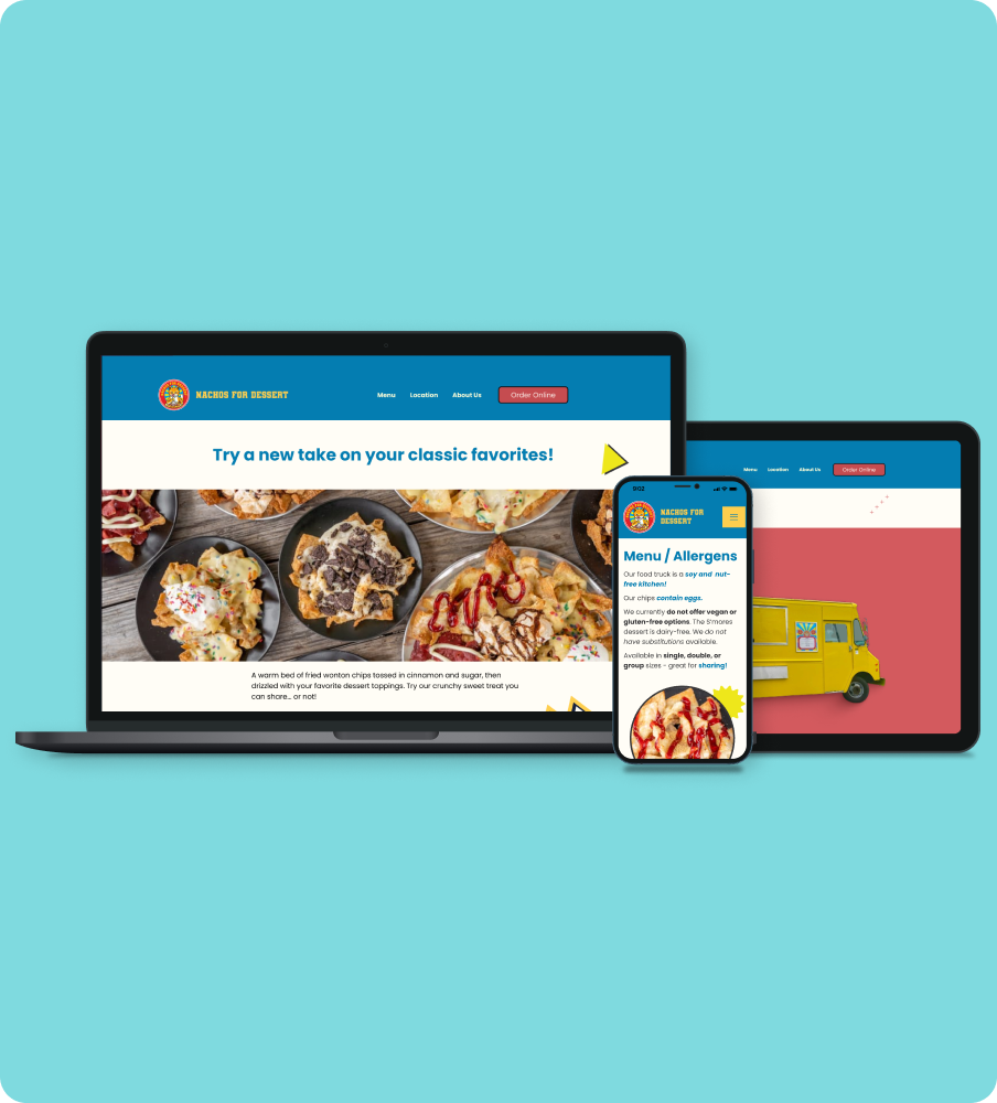
A responsive website redesign for a local Portland food truck.

An end-to-end mobile app that connects snack lovers for fun and discovery.